The World According to Deitrich Lubs

Braun ab314, the world according to Braun

Braun ab314, the world according to Braun

The AB 314 sl travel alarm clock by Braun is a design by Deitrich Lubs and Dieter Rams. It is an elegant plastic portable clock, a product from Lub’s time as director of design for Braun in the 1980’s.  It’s one of the first Braun designs I bought for myself. I had no need for its intended use; I was a teenager going nowhere, with no need to know what time zone I was in. The clock did serve a purpose apart from waking me up though; in the middle of a room quickly succumbing to the entropy of a teenager’s cleaning habits it was the promise of order and escape through travel.

The clock itself is one of those post-ULM German objects that just exude rightness. Apart from minor flourishes: a chamfered shape at the top of the front face and edge of the lid covering the clock face (the Lubs designed watch I wear also shares this chamfer motif) and the soft curve shaping the back face, it is an elemental blank rectangle. The hinged protective cover has the circle of the clock face in low relief, a fractionally raised disk – as though the face were showing through. Folding down the lid reveals the clock face and a map of the world time zones. Select cities fill in for geo-political boundaries. A businessman’s world, the planet reduced to cities separated by hours without political or physical features.

The choices on the map are increasingly curious to me as the years pass. Why were those particular cities chosen? Dubai –long a magnet for European consultancies  – appears over more politically fraught Middle Eastern cities (Jerusalem, Mecca), with the bonus that Israel’s existence can remain conveniently un-acknowledged. My own city, Toronto, succumbs once more to invisibility as more beautiful Vancouver and more sophisticated Montreal carry the flag for Canada.  China, India and Brazil all appear, though not with the cities one might chose today were the map to be redrawn. Africa is represented by cities in South Africa (at the time in the full grip of Apartheid) and Kenya, Ghana and Senegal.  The selected cities are in some way a snapshot of the world worth knowing in 1980, as acknowledged (or not) by the modernist house brand Braun.

Advertisement

Out of Print

images

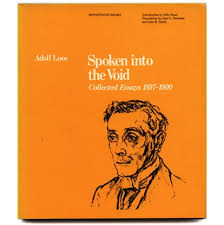
I keep seeing the yellow cover of the Oppositions Books edition of Rossi’s Architecture of the City and I always have the same quick reaction, that leap in my heart when I hope they’ve finally come around to re-issuing “Spoken into the Void”, the book of Adolph Loos essays republished as a collection in 1982.

Spoken into the Void was my introduction to Loos’s writing. There was of course the classic Ornament and Crime, but that might be my least favorite of his essays, his witty and catty personality is on more full display in Poor Little Rich Man and The Principle of Cladding. Beginning in the mid-1980’s there was a revival of interest in Loos, who fit into a more ambiguous modernity that seems closer to what used to be called postmodernism, but now is called nothing and just is. The re-examination of Loos in Raumplan vs. Plan Libre, including  an essay by the excellent Beatrice Colomina, brought the work under the lens of academic criticism and, as often happens, seemed to push a direct reading of the primary source further away. In any case it’s a book I wish would be republished and more widely available.

On that last point, it seems that as a consequence of being younger, poorer, and not realizing that some things are available only for a fleeting time, I find myself looking for books which just don’t exist for less than $200 anymore; Anthony Vidler’s “The Writing of the Walls” or Fritz Neumeyer’s “The Artless Word”.  Instead of these, or excellent general surveys by Tafuri & Dal Co or Banham we get Taschen. Where exactly is that world we were promised of everything available everywhere – it doesn’t seem to exist, even behind a pay-wall.

Sincerely Disappointed

serpentine Gallery Garden Pavillion, photo copyright Iwan Baan

Sepentine Gallery Garden Pavillion, photo copyright Iwan Baan

I was born at the end of 1960’s, an era one critic – I can’t remember who – called a “time of unprecedented sincerity”, he wasn’t being complimentary. I can’t help but think this attitude of sincerity was fundamentally unhelpful. It left me unprepared to grapple with the underlying relationships and motivations behind the things people were saying.
I first became aware of architecture with a capital A early in high-school and through reading, probably the worst time and way into almost any field. I loved Gropius (sorry, I know…) and the early Modernists utopian visions and really believed the sincerity of those words about improving society and transforming the world. It seems like only sheer luck in retrospect that I didn’t stumble onto more dangerous writing, like Ayn Rand.
It remained with me for many years that Modernism, contemporary architecture, represented a belief in social good and the betterment of the contemporary world. I know enough now to recognize the utopian naiveté of that association between aesthetic pursuit and political pursuit. Some modernism works well for Fascist purposes, and some modernists were Fascists.
So with apologies for the adolescent quality of this complaint, I feel disappointed about the work of Sou Fujimoto. Not so much the work really, but the gulf between the work and the means of its production. This past month the online architecture magazine Dezeen published an interview with Fujimoto on the opening of his firm’s design for Serpentine Gallery garden pavilion in London. In the interview Fujimoto is quoted as saying: “In Japan we have a long history of interns and usually the students work for free for several periods. It’s a nice opportunity for both of us: [for the employer] to know younger generations and for them to know how architects in Japan or different countries are working.”
Is it too much to hope that people are still paid for their labour? Is that, in the face of the free market, now just utopia too?
Mr. Fujimoto is not alone of course, many modern firms designing contemporary projects indulge in pre-modern labour practices, but what does this really suggest other than that good design is too expensive and free labour must be made part of the equation to achieve it.
Is it too much to ask that “modern” architects leave behind pre-modern habits like not paying for work done?

Do You Realize?

DownloadedFile


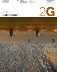
So the last print edition of the Spanish architecture journal 2G (would it be more precise to call it a Catalan journal in Spanish and English?) was issue #64 on Portuguese architect Ricardo Bak Gordon.

From when 2G first appeared in 1997, its issue featuring David Chipperfield, it was clear that the magazine possessed an excellence that was immediate. The graphic design dispensed with the frenetic image cataloging of architectural publishing that copied Mau and Koolhass’ SMLXL and instead reached back to claim something like the calm modernist authority of Massimo Vignelli’s design for the Japanese journal A+U. The structure of the magazine, with minimal advertising, beautiful photography and drawings, along with collected essays from the featured architects and top academic or critical commentators, took it out of the temporal realm of the design journal and imbued it with the character of a standalone monograph.

In the intervening 16 years the editors managed to steer a path distinct from that of their competitors, featuring contemporary and classic modern work that in many cases was “untimely” in its disregard for the line of formal investigation expected from architecture in the first decade of the 21st century. There are several stand-out issues: #9 on Williams Tsien is better than any other publication I’ve seen of their work, # 12 on Craig Elwood is an excellent introduction to his work and an amazing companion piece to the wealth of publications on the Case Study House project, and I can’t imagine another magazine taking on the architecture of Max Bill as comprehensively as 2G did in #29/30, to name just three.

It’s worth pointing out that the presentation of both English and Spanish, alongside each other, differentiated by the blue colour of the English font remains, for me, the most elegant example of bilingual publication I have experienced – both are distinct, neither is privileged. The thoughtful attention to detail that gesture represents is part of what set 2G apart.

It would probably be too much to hope that the demise of the print edition is not related to the collapse of Spain’s economy in the wake of the derivative depression that has gripped Europe. I hope that the step into digital is being taken with the same spirit that launched the magazine in 1997, but I fear it’s a defensive play. It is expensive to create quality publications and few of us now seem prepared (or perhaps able) to pay. I will be trying the digital 2G in hopes that it is more than just a PDF. If time permits I will post some thoughts on it in future.

Welcome

Welcome to The Cat’s Laugh. This blog is named after a phrase in Hannes Meyer’s 1928 text “building”. Meyer wrote: “all life is function and therefore not artistic. the idea of the ‘composition of a dock’ is enough to make a cat laugh!”. Meyer was the second director of the Bauhaus at Dessau from 1928-30.

I always thought the phrase was funny and Meyer is such a fascinating figure, his legacy at the Bauhaus relatively unknown by the general public. There may be some future post on Hannes Meyer, but the blog is really intended as a way to share images and ideas about architecture and design. I hope you enjoy it!